the 30 minute website creation tutorial.
(This tutorial by Carl van Tonder
(Permission granted to be displayed here.)
1. Who is this for?
This tutorial is for anyone who wants to create a website. There are many 'website' tutorials out there, but basic HTML is not a website. Nor is PHP, Javascript, business planning or any other out-of-focus subject vaguely related to web design.
The website I will help you create will be yours, and that is a critical aspect of this tutorial. No templates will be used and no source will be provided (but I will tell you how to use both effectively). This method will work for a business website, a personal blog, the website of software you have created; anything. It is a guide to creating a good website.
2. Conventions and practices
I will be assuming that you have a working knowledge of all discussed technologies (HTML, FTP etc.),or a readiness to learn at least how to implement them.
I myself use Bluefish for code editing, or failing that PHP Designer 2005. Failing that, notepad. At no stage along this path will I advise the use of WYSIWYG tools. I personally do not make heavy use of images, but I will explain how to implement them properly. I will not advise the use of Flash for anything other than short videos, cartoons and games. If you desperately want these, look elsewhere. I don't believe in other usages of Flash but many do and will be happy to help.
3. Stage 1: Planning
When thinking about your website, consider the following important questions:
What will it be about?
The following are suitable answers to this question:
- A personal blog
- The homepage of a piece of software or a gallery of graphics you have created
- A webdesign resource with tutorials, graphics and templates
- A fan site
- or anything else that is similarly specific....
It is dangerous in terms of focus and coherence to combine things, e.g. make a Harry Potter fansite that's also got Gorrilaz song lyrics. The number of people who like Harry Potter and Gorrilaz is going to be far smaller than either the number of people who like Harry Potter or Gorrilaz. Consider making two websites if your passions are that strong
One thing that does go well with other things is a blog, but it is not necessarily a good idea to merge the two to a huge extent (e.g. have development updates on your software on the same page as how great your holiday is
Who are you aiming at?
This is linked with the above, and should probably be decided at the same time as the subject material of your website. This will have a great impact on later design choices, so make sure you plan it carefully. Ensure that if you identify more than one distinct group of people you are aiming at you are able to divide your website in a similar way to your viewers, e.g. different sections or mayber even different websites.
Are you going to try and make money?
If the answers to the above two questions create a large enough group of potential target visitors then you may well be able to at least pay your own website bills from it. Consider things like keyword rankings and how well sites based on similar topics are doing. Also consider whether there is a gap in the market or whether it is sort of saturated. Remember, however, that this is a delicate balance and aiming too niche will make you lose visitors again. Making money from a website is a very complex science and I will not dwell on it too much for the benefit of those who aren't soulless capitalists.
How much work are you willing to put in?
A good website is a significant commitment. A news- or article-based website requires frequently-updated content to draw visitors, and even an active forum requires near-constant moderation to keep standards high and visitors returning. The best way of ensuring visitors is to create original content, and bear in mind that simply indexing or reproducing others' work is unlikely to get you anywhere unless this is actually a useful service.
A graphics website needs graphics, a Blog needs blog posts, a news website needs news and a tutorials website needs tutorials. Bear this in mind when creating it, and expect a lengthy commitment to keep it active. Consider drafting in others to help with updating content and ensuring a steady stream. I write actual content for only one of my 3 websites.
How much are you willing to learn?
There is obviously massive potential to create a website without any knowledge whatsoever with such tools as Frontpage, PHP-Nuke and the like. Unless, however, your content is genuinely unique and excellent, there is a limit (and not a very forgiving one) on the number of people that will put up with default skins and default settings. In addition, you'll be unable to fix or diagnose problems and your website will come to a slowdown as optimizations tasks are left un-done. It is beneficial for everyone if you are prepared to learn even a small amount along the way.
4. Stage 2: Design
At this stage, things begin to fork off. Depending on budget, time and level of e-competence you have several options in terms of design:
Do your own everything
If you want a website that you can strum like a harp, you may need to do everything yourself. From the PHP CMS to the CSS styles to the JS menus to the Cron scripts to the Mysql databases to the bare HTML, everything. A single-user personal blog does not need about 60% of the features of Blogger, LJ or Wordpress. A light CMS may well need some advanced features later on, but something as unwieldy as PHP Nuke is doubtless a bad starting place.
(NB: I do NOT recommend or use a custom forum.)
Templates/pre-built systems
The internet is positively littered with free and paid-for website templates and free CMS and Forum software. Some are better than others (obviously) and the magic is in sorting out the wheat from the chaff. Follow my design principles below when selecting a template, and select any pre-built software based on requirement. A 2- or 3- user news site doesn't need as large a system as a 30-user one, and few of these systems are really scalable. Consider a Wiki as a CMS or cutenews for a simple news CMS.
Generally things that enforce 'MADE WITH FOOPROG' or 'POWERED BY FOOPROG' messages are bad, and the few £ to remove therse messages may be worth it in some cases. In short you don't want people coming to your website and thinking, 'Hey, Drupal.' as opposed to 'Hey, Harry Potter-themed Gorrilaz videos. Cool!'. Another good rule of thumb is the fewer links to other sites, especially prominent ones, the better. This is especially true with services in broadly the same area as yours.
Hire someone
You can always hire some schmuck to do all this for you. Depending on the company, this may well remove problems with prominent 3rd-party software on your site and also take much of the work out of your website. Some downsides are that website designers massively, massively overcharge and there are probably more cowboy webdesigners than cowboy plumbers.
Take a long look at their website and consider if you'd be happy with that website. Decide whether you're saving money on your website by hiring a webdesigner and whether you're going to get return on this investment.
Consider whether you'd care if the amount of money you're paying would be significant if it turned out to get you nowhere, and if it is, consider if it's large enough for anyone else to care if it does. If your budget is £100 and you're on a limited income, paying a webdesigner is possibly not a great plan, as £100's worth of webdesign isn't very much, and if you think they have (or they have) stolen your money by providing a substandard (or worse, no) service, it'll be difficult to find authorities that care about a £100 loss. In addition, scammy webdesigners are unlikely to be scared by the legal faculties of someone with a £100 budget.
5. Stage 2: Design (part 2)
Having decided who and how your website will be made, here are some tips on how to do it. If you're getting a template, get one that fits these or get one that nearly does and modify it until it does. If you're designing from the ground-up then try and plan according to these. If you're hiring someone, you might want to mention if any of them wildly contradicts these guidelines, but if they tell you that it's bullshit (in a convincing manner) then it probably is and they know best. Anyway:
Make sure the website is yours
This, unsurprisingly, is by far the most important part of making your website,. When people fire up your website in a browser they want to know which website they're on, not which CMS it's using or which WYSIWYG program it was deigned in. On this note, avoid:
- Any default templates. At all. PHPBB, PHP-Nuke, Frontpage, ANYTHING
- Anything that you can't template easily.
- Anything that is obviously that system. If it's an often-used theme, a recognisable interface or anything like that, it distracts people from the fact that they're on your website
- Default HTML layouts. Grey BG, black text, blue links, purple visited links etc.
- Too many (or any) links to websites of your hosting company, your template source, your favourite search engine etc. on every page
To summarise, if there is a website that any of your visitors is likely to have seen that looks like yours, they will spend time thinking 'hey, this looks like slashdot' or whatever instead of thinking about your content.
A site designed for a purpose
There are general rules here.
A software or 'geeky' site is ordinarily clean and easy-to-use, perhaps using a Wiki if there's a lot of text (like a HOWTO archive). Colors are light and graphics are not used extensively.
Clan or gaming sites often make extensive use of slick image-based layouts to create a very graphical impression. Such sites are often doing this to (often successfully) hide the fact that there isn't a great deal of content, but they also fit in more with the graphics-centric arena of gaming.
Blogs usually use either an artsy or a clean layout similar to the first type mentioned, depending on the personality and genre of the blog.
News sites often have a clean layout, but populated with slick touches for menus and banners.
These aren't concrete and a bad but appropriate layour is debatably worse than a good but inappropriate one. Bear in mind, however, that as the amount of content increases so will the need for easy navigation and easy reading. Again, this type of thing isn't vital but do at least consider it.
A professional site.
This is vital. No-one takes you seriously if your site looks like it was designed by a 13-year-old in Frontpage Express, especially if it was. Here are some (read: all) the points.
Some things to avoid:
* Anything flashing or moving
* A website that looks like it has (or has) been designed in Frontpage express or Microsoft Word
* Useless JavaScripts like cursor trails or things like that
* Elements like clocks and counters that serve no purpose and/or are very unsubtle
* Counters at all. If your website gets little traffic, it makes it look unpopular. If it gets a lot, you're wasting resources counting it all.
* Equally, any kind of running statistics (members online etc.) suffer the same problem; bad appearence when low, system-heavy when high
* Animated GIFs. Already under the flashing/moving header, but as a rule of thumb, if you have animated GIFs on your website, delete it. The website, that is.
* Dead links
* Spelling errors
* Grammar errors
* PHP error messages. Either turn them off or (ideally) fix them
* Anything else that doesn't work.
* Flash. A Flash nav bar can ruin a day. A Flash website can ruin a week. Just don't do it. Plus they are search engine unfriendly.
-
DO:
* Have good navigation. Your users should be able to reach any page with 3 clicks, and there should be no dead links.
* Make your site look presentable in at both IE and Firefox. It is not acceptable in this day and age to screw over 20% of the internet because you're lazy. If your page is at all tech-related then you're turning your face on over an estimated 40-60% of your users by being lazy. Unprofessionalism to the MAX.
CMS, CMS, CMS
Unless you and your users want to be spending hours poking around in HTML, for the love of god use a CMS. I can't reccomend any specific ones, but many good ones like Joomla, Drupal are free.
- Please do, however, keep in mind the previously-mentioned aspects of a CMS you need to consider, i.e.
- Size and scalability; will your site have one or one hundred users? Will the CMS handle either or both?
- Customisability; can this be made to look as part of your website and not as a random add-on?
- Features; choose based on what you need, not the size of the feature list. Also remember that many allow you to add features.
- Price; a general rule of thumb is that price > £0 = NO!
- Integration; linked with customisability is how well it will look as part of your site, and whether users will be able to tell without trying what CMS it's using. This applies to forums as well but to a lesser extent.




 This is what I came up with. Do not worry, it gets WAY better, I promise. ; )
 a bit better
  She’s all glowy now
 Instant transformation!
 lovely, isn’t it?
 brush tastic.
 Almost Done!
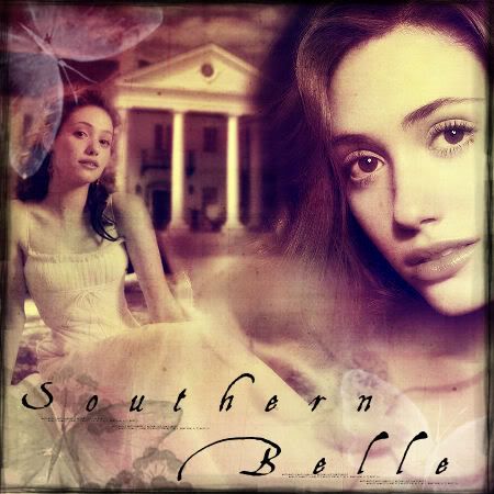 MAGNIFIQUE!